Summary: Explore the best data visualization tools of 2025 that turn raw data into stunning visuals. From Tableau to Google Charts, this guide highlights tools for all skill levels. Learn what to look for, how they work, and how mastering them can elevate your career in data science and analytics.
Introduction
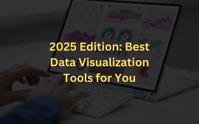
Hey there! Ever stared at a bunch of numbers and felt your brain melt? You’re not alone. That’s where the best data visualization tools come in—they turn boring data into eye-catching charts and stories you can actually understand. In 2025, these tools are not just smart—they’re super user-friendly and crazy powerful.
No tech degree needed! With the market expected to jump from $13.42 billion in 2024 to a whopping $30.7 billion by 2032, it’s clear people love seeing their data dance. In this blog, we’ll help you pick the perfect tool that fits your skills, needs, and style.
Key Takeaways
- Data visualization tools make complex data easier to understand through graphs, charts, and maps.
- Tools like Tableau, Excel, and Google Sheets suit different experience levels and use cases.
- Customization, real-time collaboration, and AI insights are essential features to look for.
- Visualization is vital for data scientists, analysts, and decision-makers.
- Use these tools with Pickl.AI’s data science courses to advance your career.
Key Features to Look for in a Visualization Tool
Choosing the right data visualization tool can be tricky, especially with many available options. Whether you’re a student, a business owner, or just curious about data, these features can help you make the best choice. Look for tools that make your work easier and faster.
- Customization Capabilities: You should be able to change charts, colors, and layouts to match your needs and style.
- Integration with Data Sources: A good tool should connect easily to your data, whether it’s in Excel, Google Sheets, or a database.
- Real-Time Collaboration: Working with others? Choose a tool that lets you and your team see updates instantly and collaborate smoothly.
- AI-Assisted Insights: Some tools use smart technology to highlight patterns or trends in your data. It saves time and helps you spot useful information quickly.
What’s Common Among All the Data Visualisation Tools?
Although there are different Data Science tools, their prime objective is the same: to unfold the meaning hidden behind complex data.
Hence, all these tools have one thing in common: their objective is to unveil information and present it in a comprehensible manner. No matter which tool you choose, data visualisation can be a powerful way to see and understand data.
Data visualisation tools convert information into graphs, charts, or other visual representations. Data Scientists use these tools to create static and non-static visualisations. Static visualisations are images generated from data that do not change when the data changes, while interactive visualisations change when the data changes.
Top Data Visualisation Tool List

There are many different data visualisation tools available. Some are designed for specific types of data, while others are more general. Some are also designed to be used with specific software applications.
Tableau
Tableau is a leading data visualization tool for creating interactive dashboards and detailed reports. It connects to numerous data sources and transforms complex data into easy-to-understand visuals. Businesses use it for analysis, decision-making, and storytelling, making it a go-to choice for professionals across various industries.
Key Features:
- Drag-and-drop interface for building visuals
- Real-time data analysis
- Integration with multiple data sources
Pros:
- User-friendly and intuitive
- Powerful analytics and dashboard features
- Excellent community and support
Cons:
- Can be expensive
- Requires data understanding for effective use
- Maybe overkill for small projects
Google Sheets
Google Sheets is a cloud-based spreadsheet tool that allows users to create and collaborate on data-driven tasks in real-time. With built-in chart options and seamless integration with other Google Workspace tools, it is a lightweight solution for simple data visualisation and collaborative reporting needs.
Key Features:
- Cloud access from any device
- Built-in chart creation
- Auto-save and version history
Pros:
- Easy to use
- Great for team collaboration
- Completely free
Cons:
- Limited visual customisation
- Dependent on internet connection
- Not ideal for large datasets
Microsoft Excel
Microsoft Excel is a classic spreadsheet software known for its data storage, analysis, and visualization capabilities. It includes built-in charts, pivot tables, and advanced formulas. Excel suits users ranging from students to professionals who must explore data patterns, perform calculations, and visualize data trends effectively.
Key Features:
- Built-in charts and pivot tables
- Advanced formulas and functions
- VBA scripting for customisation
Pros:
- Extremely flexible and powerful
- Supports complex data operations
- Broad compatibility and integration
Cons:
- Steep learning curve
- Slower performance with large data
- Some features are paywalled
Infogram
Infogram is a web-based platform that enables users to create visually appealing infographics, charts, and maps. With a drag-and-drop interface, ready-made templates, and media integration features, it is ideal for marketers, educators, and content creators looking to present data visually engaging and shareable.
Key Features:
- Drag-and-drop editor
- Templates and media embedding
- Supports multiple data sources
Pros:
- User-friendly interface
- Great for marketing visuals
- Lots of custom templates
Cons:
- Limited free plan
- Expensive premium tiers
- Offline access unavailable
ChartBlocks
ChartBlocks is an online chart builder allowing users to design, customise, and embed charts without writing code. Its intuitive chart wizard guides users through each step, making it perfect for beginners or professionals who want quick, embeddable visualizations for websites, blogs, and presentations.
Key Features:
- Chart builder wizard
- Customisable chart designs
- Export in various formats
Pros:
- No coding required
- Free version available
- Easy embedding of charts
Cons:
- Limited options on free plan
- Interface could be more modern
- Requires paid plan for high-res exports
Datawrapper
Datawrapper is a browser-based tool designed for creating interactive and responsive charts, maps, and tables. It is widely used by journalists, publishers, and non-technical users who want to convert raw data into compelling visuals without needing design or coding skills. It’s clean, fast, and beginner-friendly.
Key Features:
- Supports CSV, Google Sheets, Excel
- Responsive visualisations
- Easy embed options
Pros:
- Beginner-friendly interface
- Free version with good functionality
- Interactive and mobile-friendly charts
Cons:
- Limited design customisation
- Complex visuals need extra effort
- Data security concerns for sensitive info
Polymaps
Polymaps is a free JavaScript library built for creating dynamic and multi-zoom maps using geographic data. It’s ideal for developers looking to visualize spatial datasets on web interfaces. Lightweight and flexible, it supports a variety of map types and formats, including GeoJSON and vector tile layers.
Key Features:
- Multi-zoom mapping
- Supports GeoJSON and KML
- Lightweight and fast
Pros:
- Great for geographic data
- Interactive and customisable
- Free and open-source
Cons:
- Requires coding knowledge
- Limited to geospatial visuals
- Not ideal for beginners
Grafana
Grafana is an open-source platform used for real-time data visualization and monitoring. It connects with multiple databases and allows users to create dynamic dashboards with custom alerts and reports. Popular among IT teams and developers, it’s best suited for operational metrics, server monitoring, and performance analysis.
Key Features:
- Supports many data sources
- Alerting and notification system
- Custom dashboards
Pros:
- Free and open-source
- Highly customizable
- Large plugin ecosystem
Cons:
- Setup can be complex
- Not beginner-friendly
- Some tools lack native support
FusionCharts
FusionCharts is a JavaScript-based charting library used to build interactive data visualizations for web and mobile platforms. It offers various customisable chart types and supports multiple data formats. Developers favor its flexibility, cross-browser compatibility, and smooth integration with modern frameworks.
Key Features:
- Over 100 chart types
- Rich APIs for developers
- Works with many data sources
Pros:
- Highly customisable
- Supports all platforms and browsers
- Wide chart variety
Cons:
- Paid plans can be pricey
- Not all browsers fully supported
- Can be tricky for beginners
Google Charts
Google Charts is a free, web-based data visualization tool for creating interactive and customisable charts using dynamic data. Built with HTML5 and SVG, it works seamlessly in all modern browsers without plugins. It’s ideal for embedding charts on websites and supports multiple data sources, including Google Sheets and SQL.
Key Features:
- Wide range of chart types (e.g., maps, timelines, gauges)
- Built using HTML5/SVG—no plugins needed
- Customisable with CSS and real-time data support
Pros:
- Completely free to use
- Offers a large variety of chart formats
- Compatible across all major browsers
Cons:
- Limited support options beyond forums and tutorials
- Requires basic coding knowledge for customization
- May not be suitable for offline or desktop use
How Can Data Visualisation Tools Boost Your Career?

Data visualisation has advanced significantly in the last few years. These tools help Data Scientists and analysts easily transform data into information and pictorial representation, which is better for decision-making.
However, data visualisation is not just for analysts and managers. In today’s data-driven world, data visualisation is a valuable skill for anyone who wants to further their career.
Data visualisation is a key tool for Data Scientists, allowing them to communicate their findings effectively to technical and non-technical audiences. By visualising data, Data Scientists can better understand complex relationships and patterns, identify trends and outliers, and communicate their findings in a more accessible and engaging way.
Wrapping It Up !!!
Data visualization is no longer just a nice-to-have—it’s essential in today’s data-driven world. Whether you’re analysing sales data, tracking website traffic, or presenting trends to stakeholders, using the best data visualization tools helps you tell stories that numbers alone can’t.
Mastering these tools improves clarity and decision-making and boosts your career in data science. Want to level up? Join Pickl.AI’s data science courses to gain hands-on skills in visualization, analytics, and machine learning.
With expert mentorship and real-world projects, you’ll turn data into impact. Your journey to becoming a data-savvy professional starts now!
Frequently Asked Questions
What are the best data visualization tools for beginners?
Tools like Google Sheets, Microsoft Excel, and Datawrapper are beginner-friendly and don’t require coding. They offer simple interfaces with drag-and-drop features, making them perfect for learning the basics of data visualization quickly and efficiently.
How do data visualization tools help in data science?
The best data visualization tools simplify complex datasets, uncover trends, and improve communication. Data scientists use them to analyze patterns, build dashboards, and make insights accessible for both technical and non-technical audiences.
Are there free data visualization tools available?
Yes, tools like Google Charts, Datawrapper, and ChartBlocks offer free versions with strong functionality. They are ideal for students, startups, and freelancers who need to create visuals without paying for expensive software.
Authors
-

Written by:
Versha RawatReviewed by: