Summary: Interactive visualization transforms raw data into dynamic, engaging experiences, allowing users to explore, filter, and analyse information visually. This guide covers the essentials of interactive visualization, including its features, benefits, leading tools, use cases across industries, best practices, and future trends—empowering organizations to make smarter, faster, and more collaborative decisions.
Introduction
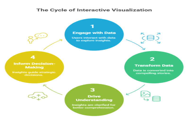
In today’s data-centric landscape, organizations are inundated with vast amounts of information. The challenge is no longer just collecting data, but making sense of it. Traditional static charts and graphs, while useful, often fall short when it comes to exploring complex datasets or uncovering nuanced insights. This is where interactive visualization comes into play.
By allowing users to directly engage with data, interactive visualizations transform information into compelling, data-driven stories that drive understanding and informed decision-making. This guide will walk you through the essentials of interactive visualization, its benefits, tools, use cases, best practices, challenges, and what the future holds.
Key Takeaways
- Interactive visualization transforms data exploration into an engaging, user-driven experience.
- Real-time filtering, drill-down, and customization empower faster, deeper insights.
- Leading tools include Tableau, Power BI, Qlik, Zoho Analytics, and D3.js.
- Effective design balances interactivity, clarity, and accessibility for all users.
- The future promises AI-driven, collaborative, and immersive visualization experiences.
Key Features of Interactive Visualizations
Interactive visualizations are defined by their ability to turn data exploration into an active, user-driven experience. Here are the key features that set them apart:
Filtering and Drill-Down
Users can filter data by specific categories, timeframes, or metrics, and drill down into granular details, revealing insights that static visuals might hide.
Hover and Tooltips
When users hover over data points, additional context such as exact values, percentages, or related metrics appears, making complex data more accessible without cluttering the main view.
Dynamic Updates
Interactive visuals can update in real time or reflect changes instantly as users interact with filters, sliders, or new data streams, ensuring that insights are always current.
Zoom and Pan
Users can zoom in on specific data ranges or pan across large datasets, focusing on trends or anomalies that matter most to them.
Customizable Views
Drop-down menus, sliders, and toggles allow users to tailor the visualization to their needs, selecting what data to display and how to display it.
Linked Visuals
Multiple charts or dashboards can be interconnected, so actions in one visualization (like selecting a region or product) update related visuals, providing a holistic view of the data.
Export and Sharing
Users can export customized or filtered views as images, PDFs, or interactive reports, making collaboration and presentation seamless.
These features collectively empower users to move beyond passive observation, encouraging deeper exploration and discovery.
Popular Tools for Creating Interactive Visualizations
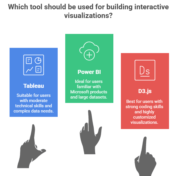
A wide range of tools is available for building interactive visualizations, each catering to different skill levels, business needs, and technical environments. Choosing the right tool depends on your technical skills, data complexity, and the specific needs of your organization or project.Here are some of the most popular options:
Tableau
Known for its intuitive drag-and-drop interface and powerful interactivity, Tableau enables users to build sophisticated dashboards without coding. It’s widely used for business analytics and enterprise reporting.
Power BI
Seamlessly integrated with Microsoft’s ecosystem, Power BI offers real-time dashboards, strong data modeling, and easy sharing within organizations. Its user-friendly interface makes it a favorite for business intelligence.
Zoho Analytics
This tool stands out for its ease of use, AI-powered insights, and embedded analytics capabilities, making it ideal for small to medium businesses and those looking to integrate analytics into their products.
Qlik Sense
Qlik’s associative data model allows users to explore data in any direction, uncovering hidden relationships and insights. It’s popular for self-service analytics and enterprise BI.
Google Data Studio
Free and cloud-based, Google Data Studio is especially useful for marketing and web analytics, offering seamless integration with other Google products like Analytics and Ads.
D3.js
For those with coding expertise, D3.js provides unmatched flexibility for creating custom, web-based interactive visualizations. It’s open-source and highly customizable, making it a top choice for bespoke projects.
HEAVY.AI
Designed for real-time, big data visualizations, HEAVY.AI excels in geospatial and IoT analytics, handling massive datasets with speed and interactivity.
Benefits of Using Interactive Visualizations

Interactive visualizations offer a host of advantages that can transform how organizations and individuals work with data benefits make interactive visualization a vital tool for anyone looking to extract maximum value from their data.
Simplifies Complex Data and Accelerates Decision-Making
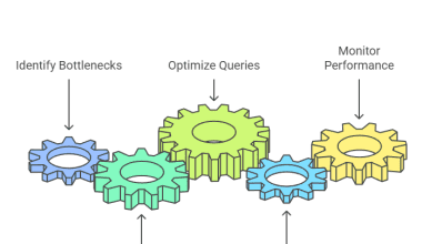
By enabling users to filter, zoom, and drill down, interactive visuals make large and complex datasets easier to understand. Real-time exploration and instant updates help users make faster, more confident decisions based on the latest insights.
Boosts Engagement and Bridges Expertise Gaps
Interactive elements turn passive viewers into active participants, encouraging deeper exploration and collaboration. The intuitive interfaces make data accessible to everyone, regardless of technical background, fostering a data-driven culture.
Supports Real-Time Analysis and Enhances Storytelling
Live dashboards and streaming data visualizations empower organizations to monitor KPIs, respond to changes, and act on insights instantly. Interactive visuals help present data-driven stories more effectively, making reports and presentations more compelling and persuasive.
Use Cases Across Industries
Interactive visualization is revolutionizing data analysis and decision-making in almost every sector. Here’s how different industries are leveraging its power:
Finance
Investment firms use interactive dashboards to monitor portfolio performance, analyse market trends, and detect fraud by visualizing transaction patterns in real time.
E-commerce
Retailers analyse customer behaviour, segment audiences, and monitor key performance indicators like sales and conversion rates, all through interactive dashboards that update as new data arrives.
Healthcare
Hospitals and clinics track patient outcomes, monitor vital signs, and visualize disease outbreaks. This ensures proactive interventions and resource allocation, thereby increasing the effectiveness of healthcare services.
Manufacturing & Supply Chain
Manufacturers use interactive visualizations to monitor production lines, detect quality issues, and optimize logistics by tracking shipments and inventory in real time.
Marketing
Marketers analyse campaign performance, customer journeys, and social media engagement, adjusting strategies on the fly based on interactive feedback.
Education
Schools and universities track student performance, identify learning trends, and allocate resources more effectively using interactive dashboards.
Public Sector & Military
Government agencies and defence organizations use real-time operational dashboards for crisis management, resource allocation, and situational awareness.
These examples highlight the versatility and transformative impact of interactive visualization across diverse domains.
Best Practices for Building Effective Interactive Visualizations
To create interactive visualizations that truly deliver value. By adhering to these principles, you’ll create visualizations that are not only visually appealing but also genuinely useful and impactful. Consider these best practices:
Prioritize Simplicity
Avoid overwhelming users with too many options or data points. Focus on clarity and guide users toward the most important insights.
Select Appropriate Visuals
Choose visualization types that best represent your data and the story you want to tell—bar charts for comparisons, line charts for trends, maps for geospatial data, etc.
Design for Accessibility
Use high-contrast colors, readable fonts, and clear labels. Ensure your visuals are usable by people with disabilities by following accessibility guidelines.
Maintain Consistency and Offers Customisation
Use uniform layouts, color schemes, and navigation patterns to make the interface intuitive and predictable.Allow users to filter, sort, and personalize their views, making the experience relevant to their needs.
Test with Users and Provide Guidance
Gather feedback from real users to ensure the visualization is intuitive, engaging, and meets their needs.Include tooltips, legends, and instructions to help users understand how to interact with the visualization and interpret the data.
Challenges and Considerations
Despite their advantages, interactive visualizations also bring certain challenges. Addressing these considerations from the outset will help ensure your interactive visualizations are effective and sustainable.
Data Quality
The effectiveness of any visualization depends on the quality, accuracy, and timeliness of the underlying data. Poor data can lead to misleading insights.
User Overload
Too many interactive options or a cluttered interface can confuse users rather than empower them. Striking the right balance is key.
Accessibility Concerns
Ensuring that visualizations are usable by people with disabilities requires thoughtful design and adherence to standards.
Security and Privacy
Interactive dashboards often expose sensitive data. Implement strong access controls and data protection measures, especially when sharing across teams or organizations.
Selecting the Right Tool
The abundance of tools can be overwhelming. Carefully assess your technical requirements, data complexity, and user needs before choosing a platform.
The Future of Interactive Visualization
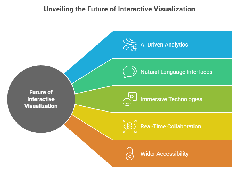
The future of interactive visualization is being shaped by rapid technological advancements and growing demand for data-driven insights. These trends will continue to democratize data and transform how organizations and individuals make sense of the world.Here’s what to expect:
AI-Driven Analytics
Artificial intelligence and machine learning will increasingly automate insight generation, recommend relevant visualizations, and personalize user experiences.
Natural Language Interfaces
Users will interact with data using conversational interfaces—typing or speaking questions and receiving visual answers, making data exploration even more intuitive.
Immersive Technologies
Augmented reality (AR) and virtual reality (VR) will enable users to explore data in 3D environments, offering new perspectives on complex datasets.
Real-Time Collaboration
Teams will work together on interactive dashboards, annotating and discussing insights in real time, regardless of location.
Wider Accessibility
As tools become more user-friendly, more people—regardless of technical expertise—will be able to create, share, and act on interactive visualizations.
Conclusion
Interactive visualization is revolutionizing how we explore and understand data, making complex information accessible, engaging, and actionable. By empowering users to interact with data in real time, organizations can uncover deeper insights, foster collaboration, and drive smarter decisions.
As technology evolves, interactive visualizations will become even more intuitive and powerful, bridging the gap between data and decision-making for businesses, educators, and individuals alike. Embracing these tools is essential for thriving in today’s data-driven world.
Frequently Asked Questions
What Distinguishes Interactive Visualization from Static Visualization?
Interactive visualization allows users to engage with data through filtering, drilling down, and real-time updates, while static visualization only presents fixed, unchangeable views. This interactivity leads to deeper insights and more informed decision-making.
Which Industries Benefit Most from Interactive Visualization?
Virtually all industries benefit, but finance, healthcare, e-commerce, manufacturing, marketing, education, and the public sector see especially high value from interactive dashboards for monitoring, analysis, and decision support.
What are the Main Challenges in Building Interactive Visualizations?
Key challenges include ensuring data quality, optimizing performance for large or real-time datasets, maintaining accessibility, preventing user overload, and protecting sensitive information in shared dashboards.
Authors
-

Written by:
Neha SinghReviewed by: