Summary: Discover how to craft a Stacked Waterfall Chart in Excel with our comprehensive guide. This tutorial covers data preparation, chart creation, and formatting to help you visualise financial data effectively.
Introduction
If you have been wondering how to create a Stacked Waterfall Chart in Excel, your search ends here. This in-depth guide will explore the details of making attractive stacked waterfall charts in Excel.
Financial and other revenue or sales data is represented using stacked waterfall charts, which may also be used to track changes over time and analyse the cumulative impacts of numerous causes.
With my detailed, step-by-step instructions and seasoned guidance, you will learn to create these informative charts like a pro.
Read Blogs:
Master VBA in Excel: Essential Tips and Tricks for Beginners.
Conquering Concatenation: Mastering Text Combining in Excel.
Understanding Stacked Waterfall Charts
Understanding the idea of stacked waterfall charts is essential before proceeding with the design process. These graphs show a sequence of positive and negative values that add up to a total.
These infographics very well illustrate the flow of money, expenses, or any other quantitative data. For financial analysts and other business professionals, stacked waterfall charts are useful tools because they let you pinpoint specific components inside a dataset.
Explore More:
Master Excel’s HLOOKUP: The Ultimate Guide to Finding Data Faster.
How to Use Count In Excel: A Guide to The COUNT Function.
MIS Report in Excel? Definition, Types & How to Create.
Preparing Your Data
The foundation of a great stacked waterfall chart lies in clean and organised data. Here’s how you should prepare your data for this task:
Gather Your Data
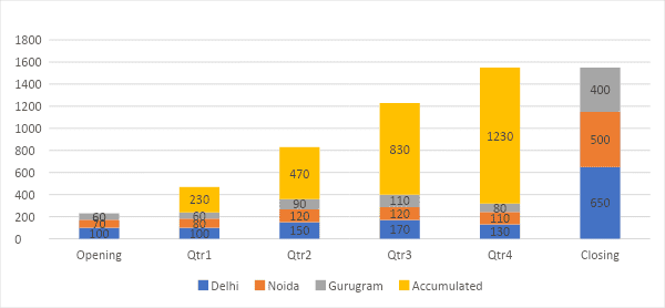
Suppose you must present the quarter-on-quarter revenue data for 3 cities where your company does business to the executive leadership team. The data is shown in the below picture:
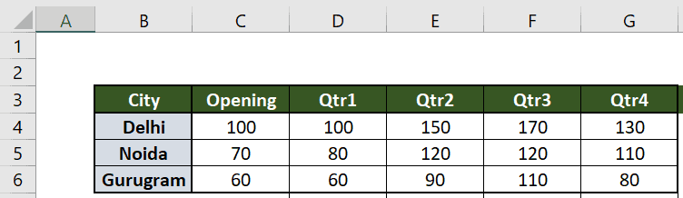
Instead of a simple stacked column chart, you want to show a quarter-on-quarter cumulative roll-up chart, a Stacked Waterfall Chart, so that it shows clear insights to the top management about each city’s revenue contribution for each period.
But, no readymade Stacked Waterfall Chart is available in Excel.
So, how do we create such a chart? Well, we will use some simple tricks here to convert a normal stacked column chart into a Stacked Waterfall Chart. Let’s begin by preparing the data in the required format.
Arrange Your Data in the Required Format
First, you need to arrange the data in the below manner:
- Add a row below the table and name it as, say – accumulated
- Put 0 value in the first cell of this row that is, for the Opening column (cell C7)
- Use the formula [ =SUM(C4:C7) ] in cell D7, which will create the base value for each of the quarters, which is the closing value for the earlier quarter exactly the way a Bridge Chart or a Stacked Waterfall Chart represents the data
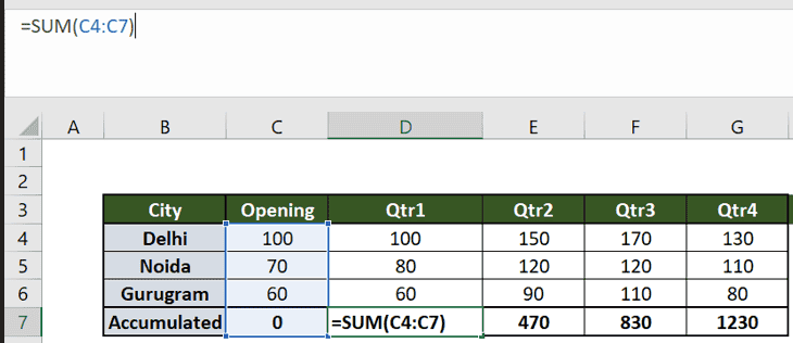
- Now, drag this formula for all the time periods, that is, until Qtr4 or until cell G7 in this case.
- This Accumulated row’s value represents the opening value for that quarter or the closing value for the earlier quarter. For example, Qtr2 started with 470 USD revenue, and during the quarter 2 period, its three cities, Delhi, Noida, and Gurugram, generated 150, 120, and 90 USD, respectively.
- Now, add a column for closing values. This new column is named “Closing,” as shown in the picture below.
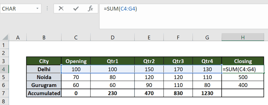
- Values for the calls of the Closing column should represent the total of the respective rows. For doing so, use the formula [ =SUM(C4:G4) ] in cell H4
- Now drag this formula till cell H6.
- In the above case, leave the grand total cell, cell H7, blank. Your data is now ready to create a nice Stacked Waterfall Chart.
Also Check: Data Validation in MS Excel: A Guide.
Creating a Stacked Waterfall Chart in Excel
Now, let’s jump into the practical part of creating a stacked waterfall chart in Excel. Follow the below steps:
- Select the entire data table from cell B 3 to cell H 7
- Click on the Insert tab (shown with yellow highlighter)
- Go to the Chart section and click on the Insert Column or Bar Chart icon
From the drop-down menu, select the stacked column chart (shown in red underlined) under 2-D Column type charts (highlighted in yellow)

- If you follow these steps, as shown in the above picture, a normal stacked column chart will appear, as shown in the image below.
- Now, we will use a few useful tricks to convert the above-stacked column chart into a Stacked Waterfall Chart.
- First, click anywhere on the chart so that the chart area is selected, and then right-click to open the popup.
- Click on the Select Data as shown below with a Red underline.
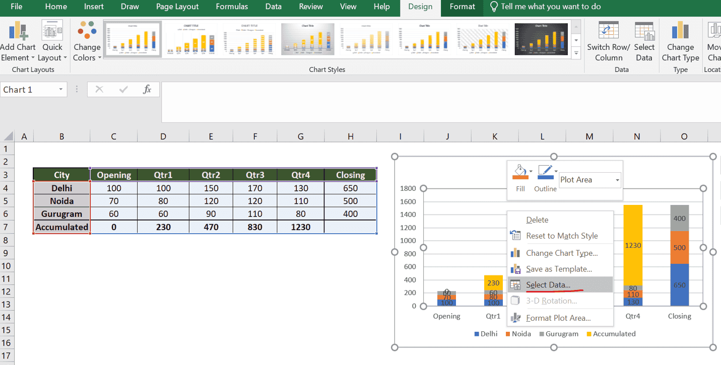
- The below popup window will be opened

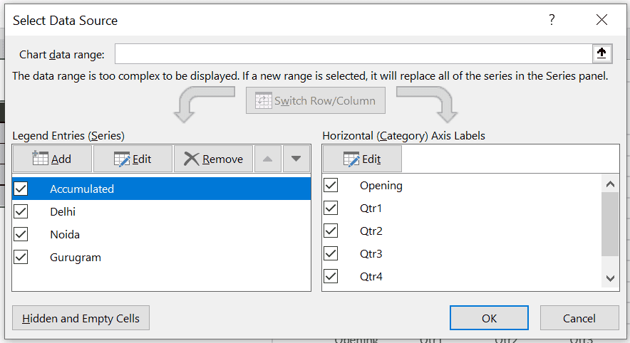
- Now select the last item, that is, Accumulated (shown as Blue highlighted), and click on the UP Arrow button (circled in red) until this particular item comes to the top.
- The window will look like the below picture.
- Click on OK.
- Your stacked column chart will be transformed once you take the Accumulated column to the top.
- Now, instead of the Accumulated parts (a yellow stacked portion of the column bar) coming to the upper part of the columns, they will now be shown in the bottom part of each column and will form the base of the opening value for each period, as shown in the picture below.
- Now single-click on the yellow part of the column to select all yellow stacked portions.
- Right-click on any of the yellow parts and click on the Format Data Series.
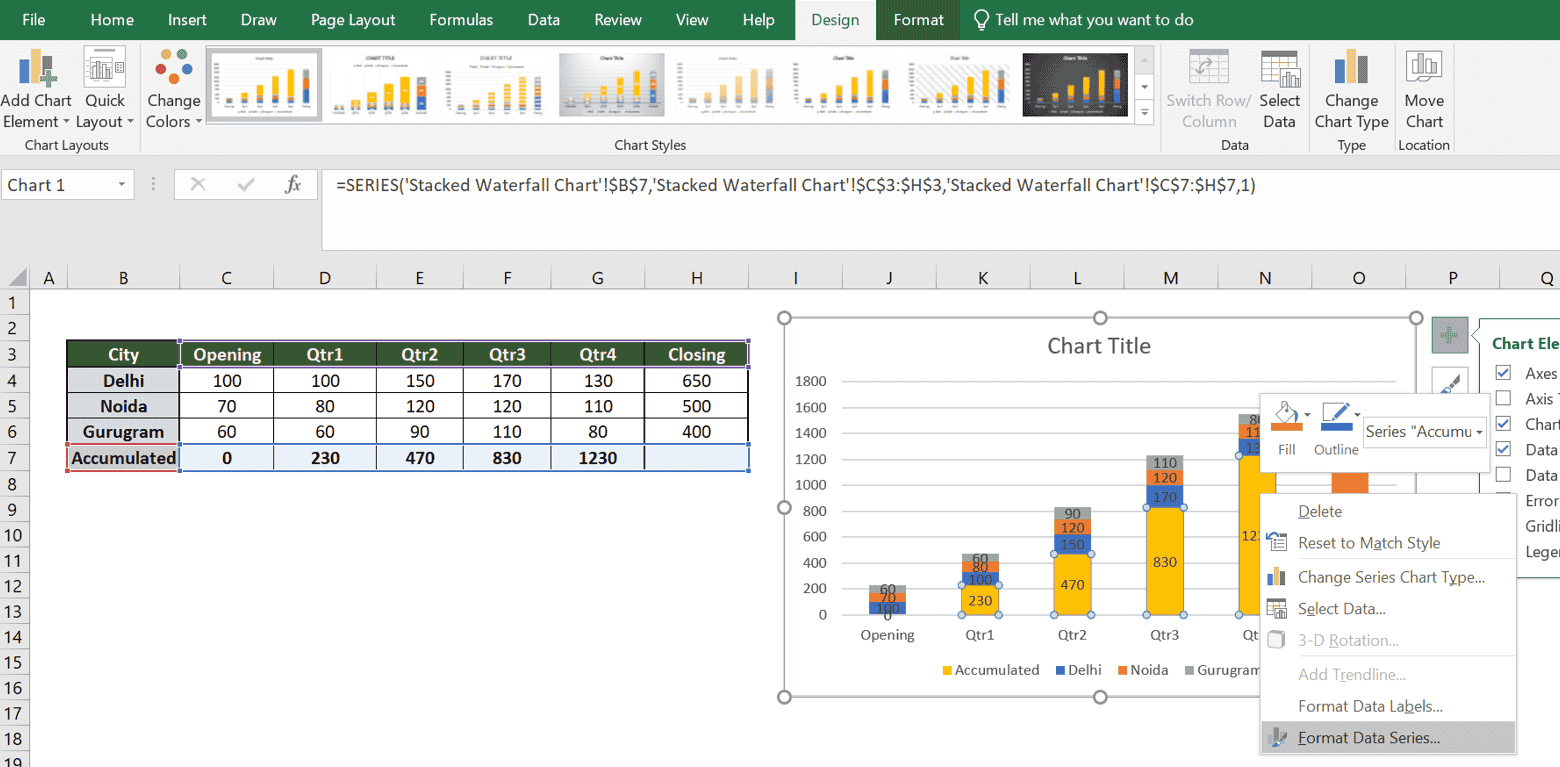
- The format window will be opened as a panel on the right side, as shown below.

- Click on the first icon (Fill and Line), encircled by red in the above picture.
- Select the No Fill option (underlined in red)
- Once you follow the above steps and close this Format panel, the Accumulated portion of each stacked column bar will vanish, and the chart will start looking like a Stacked Waterfall Chart, as shown in the picture below.

Beautification of the Chart
Let’s beautify this chart to look exactly like a stacked waterfall chart. To do so, follow the below steps:
- Click on any of the gridlines and delete them.
- Select the Accumulated or the base values and delete those values.
- The chart will start looking like the one below.
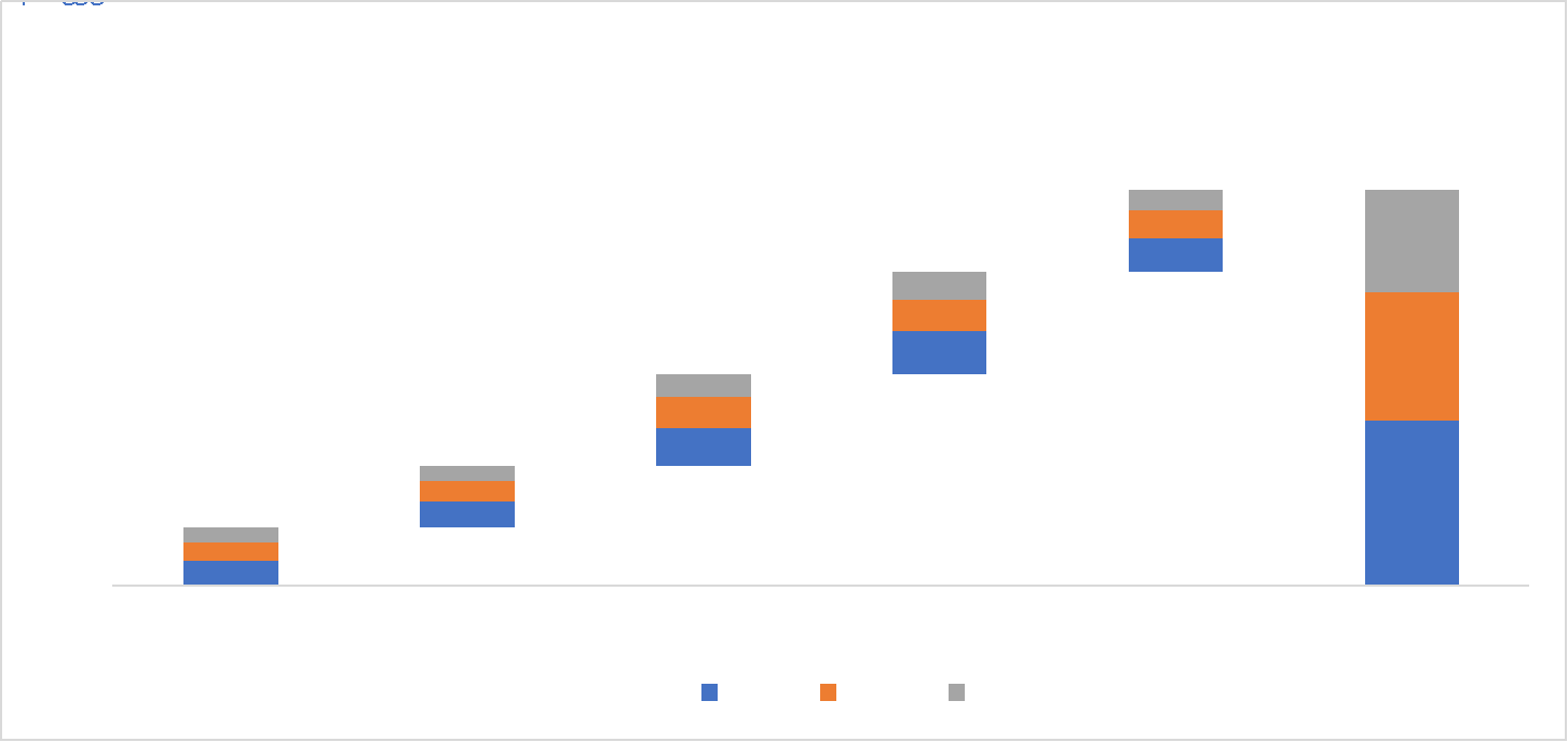
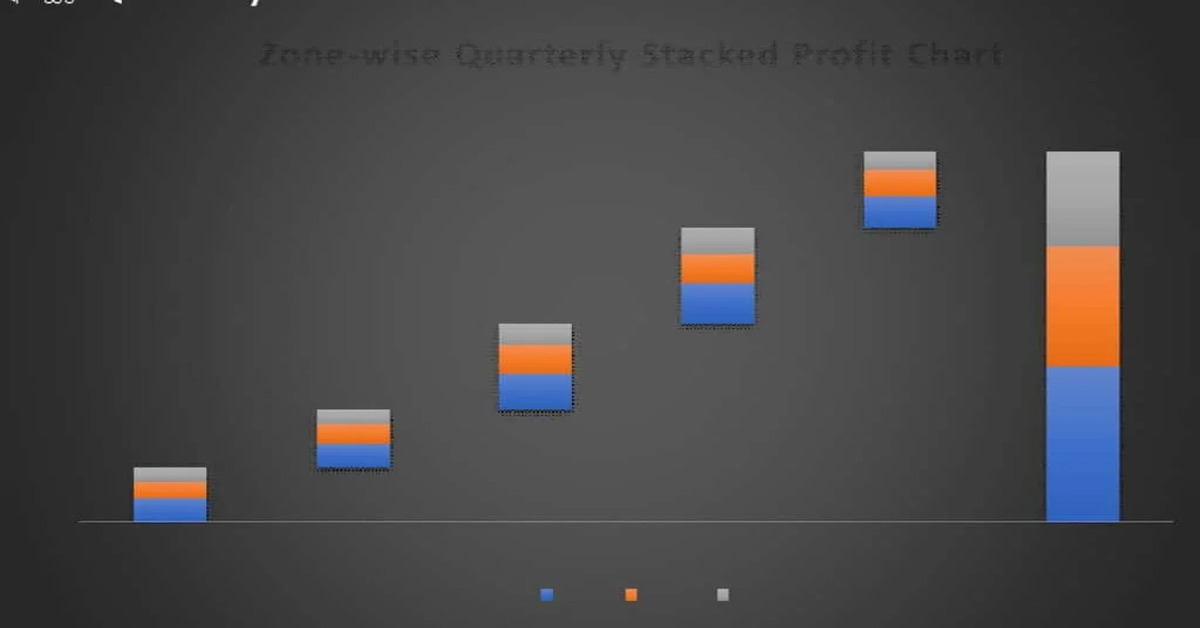
- Now, click on the Chart Title and change the name to a suitable title that reflects the chart’s meaningful nature.
- I named the chart “Zone-wise Quarterly Stacked Profit Chart”
- Select each series of the data labels and change their font to Bold and font color to white
- The final Stacked waterfall Chart will look as shown in the picture below. It provides the opening profit for each city and how each city performed on a quarter-on-quarter basis.
- At the end of the year, what was the accumulated closing profit for the entire company, and what was each city’s contribution to it?

Further Read:
How to Become a Certified Microsoft Excel Expert?
Essential Keyboard Shortcuts in MS Excel.
Frequently Asked Questions
How do I create a Stacked Waterfall Chart in Excel?
To create a Stacked Waterfall Chart in Excel, first prepare your data by adding accumulated and closing value columns. Insert a stacked column chart, then format it by moving the accumulated series to the bottom and removing its fill. Adjust data labels and gridlines to finalise the chart.
What is the purpose of a Stacked Waterfall Chart?
A Stacked Waterfall Chart is used to visually represent how sequential positive and negative values contribute to a total over time. It’s beneficial for financial analysis, as it illustrates how various factors affect cumulative totals, making it easier to understand changes in revenue, expenses, or other metrics.
Can I use a Stacked Waterfall Chart for financial analysis?
Yes, Stacked Waterfall Charts are excellent for financial analysis. They effectively depict how various economic elements, such as revenue or expenses, impact the total. By visualising these sequential changes, you gain clearer insights into the contributions and effects of each component on financial performance over time.
Conclusion
Mastering creating Stacked Waterfall Charts in Excel can significantly enhance your data analysis and presentation skills. Following our step-by-step guide and implementing our expert tips, you will be well-equipped to create impactful charts that effectively convey complex financial data.
Stacked Waterfall Charts can be a game-changer for your reports, presentations, and business insights. So, try to unlock the power of data visualisation with Excel.
Also Look At: Use of Excel in Data Analysis.
Authors
-

Written by:
Biswadip BanerjeeReviewed by: